Design Thoughts: Packaging

Hi, welcome to the Design Thoughts series, where I explore the design thinking behind common items, uncovering its subtle impact on our perception.
Intro
In this commercialised world, there are millions of consumer products for us to choose from. Nowadays, almost anything that you can think of can be bought, from the right place for the right price. When choosing what to buy, our first look on an item might be from the item on display, from a review video, or from borrowing it from a friend. Then, when we finally purchase the item, most of the time we would get it in some sort of packaging.
Packaging can be used to add to the ownership experience of the product. A common is example is packaging for tech product. Unboxing videos of tech products is a genre in itself, with channels dedicated to it. I enjoy those videos because I can feel the second hand excitement of unboxing the product. However, no matter how good the packaging, we wouldn't purchase a tech product just for it.
For grocery store items, packaging can be a way to stand out among competitors. Grocery stores usually arrange items based on category. Imagine walking through a cereal isle, where it has all different cereals side by side. Some cereal boxes with bright colours might catch the eye first. A box with a nice concise description can make it the "obvious" choice. And a box with a cartoon character might look the best for a child (or adults too!). For everyday consumables like cereal, the design of the box might be a large factor of our purchase decision.
Packaging can also be focused on utility. Well-designed take away boxes can mean that the food is easier to eat and therefore more enjoyable. On the other hand, horrible packaging can reduce the enjoyment of a meal, no matter how tasty it is. The packaging can be as important as the content.
In this post, I am going to write about three examples of packaging that I thought was quite unique and interesting. For each example, I am going to analyse it and attempt to uncover the design thinking behind it.
Nasi Lemak House - Takeaway Boxes
When I was a university student, I lived near a restaurant called Nasi Lemak House. As the name implied, they sell nasi lemak, the Malaysian rice dish. I remember that it was one of the restaurants that I first visited after I moved to Melbourne. When I first tried it, I didn't like it that much and I'm not at all a picky eater. There was nothing in particular that was wrong with it, I think it tasted okay, but somehow I never craved more for it.
Few years after that, the restaurant went through renovation. The place was much nicer, with a more modern branding. When it reopened, I was curious to see if it was any different. I went there and saw that the menu was exactly the same, so I thought there wouldn't too much difference in the food. Regardless, I went to get a takeaway serving of their nasi lemak on rice with traditional sambal, the very same one that I ordered the first time I ate there. When they handed me the takeaway box, I immediately noticed the new packaging.

From 2022, Nasi Lemak House’s nasi lemak with fried chicken and traditional sambal
This new packaging is not anything spectacular or special. It was just a plain utilitarian box, but I think that is why it was great. It was perfect for their dish. It honestly made it much easier and enjoyable to eat. Although the food recipe was probably the same as when the first time I ate it, it tasted better somehow. Because of the packaging design, I became a fan of the place and ate there often during my university days.
Singapore Airlines - Food boxes
Few months ago, I flew back to my home country, Indonesia. Covid-19 were still affecting the flights availability, and so the only one that I could get was Singapore Airlines. It was my first time flying with them, so it was also my first time eating their meals. I was delightfully surprise when I saw that the design of their breakfast box was quite similar to the Nasi Lemak House box, just much smaller.
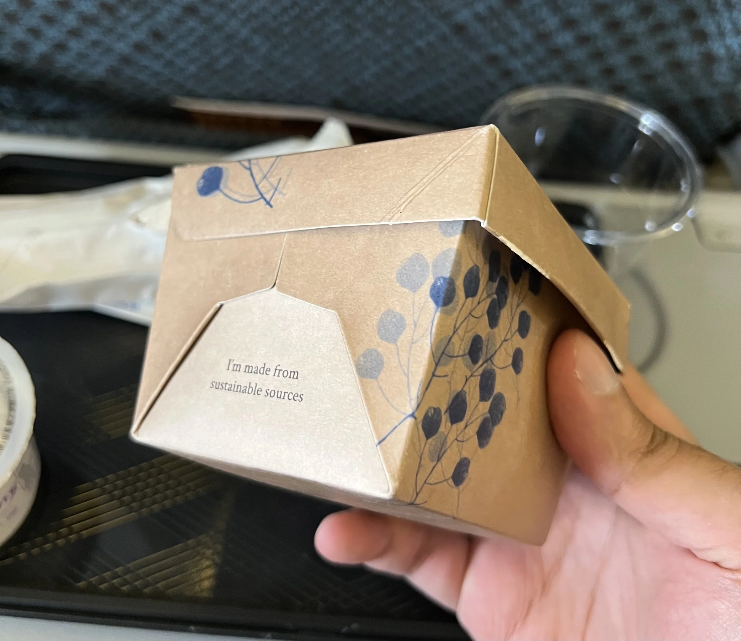
Again, I'm not claiming or saying that these boxes are revolutionary, but I think they stood out to me as nice packaging. The way they arrange the food was also quite nice. On the top, it had chicken sausage and omelette with herbs. On the bottom, it had beans on one side of the base, and a hash brown on the other side. The content was quite enjoyable, but I wonder how much was I influenced by the packaging and the arrangement, perhaps quite a lot!
Fruits with candy packaging
The last example that I have is one that I haven't actually purchased or taste. During my usual weekly grocery shopping at Woolworths, I noticed a rack full of fruits with interesting packaging.

These are fruits disguised as candy! It was also near the "fruits - free for kids" basket. Coincidence? Maybe, but I'd like to think they did it on purpose. These fruits are just normal fruits, but the packaging has various made up names on them. I can imagine that if I was a kid, it would be at the very least more enticing than regular fruits. Or if I didn’t like fruits, it can be the gateway to giving them another try and perhaps liking them.
The packaging has a different purposes to the previous examples. Instead of providing utility, the packaging is used for marketing. I am pretty interested to see the numbers on these products, whether or not they sell well compared to the same fruit without the packaging. Perhaps, it is made by the same people that sell the non-packaged fruits and they are doing research on the impact of the packaging.
Outro
That has been three food packaging design that caught my eyes. I quite enjoy looking at things and thinking about the design thinking behind them. Plain boxes that serve their utility improved the way I perceived the content. And eye catching boxes can provide a little twist to ubiquitous items. Each example might be a bit plain, but hopefully it was still interesting when they are packaged together. Thanks for reading!